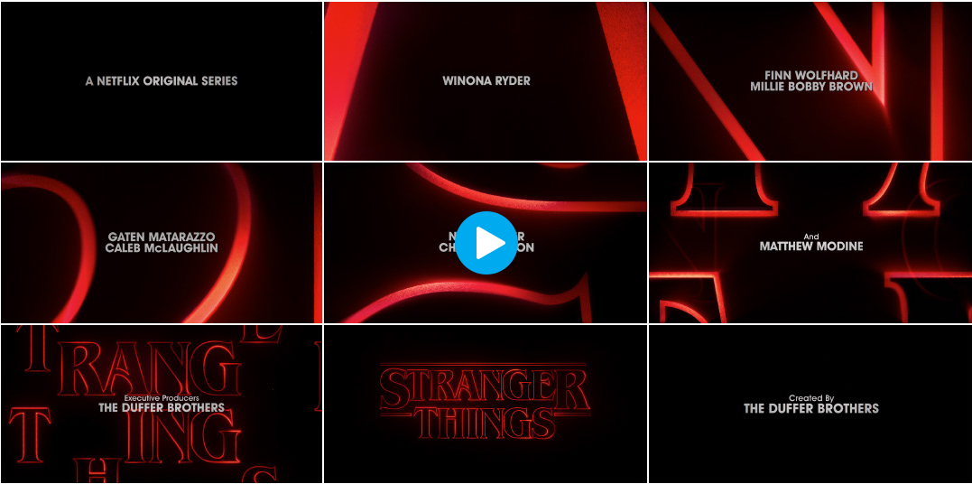
The combination of black and red lettering compliments the theme of thriller/horror as red and black are associated with evil or foreboding themes and stories. The font and the heavy synth soundtrack play upon nostalgia to grab your attention, as does the fact the letters appear almost like a neon sign from the 90s. The very slow scroll and tracking shots as the title comes together draws attention to little subtitles and amplifies suspense. The title letters come together almost like how the plot points will after many twists and turns, the letters cross over each other or rearrange. The contrast between the white lettering and the red ones allows the viewer to understand which the main title is and which the subtitle is and what they should pay attention to at that moment in time. I like it as it demonstrates an understanding of the thriller theme and pays homage to TV shows and movies that played during the time period the show is set in, giving the viewer historical context and a sense of nostalgia. It is very aesthetically pleasing and triggers feelings of mystery and intrigue. I personally would have added cut in shots to keep the viewer more engaged as in an effort to make the title care suspenseful, it is very long and does get boring after seeing it an extended number of times. Cut in shots would cause viewers to speculate about later plot points and developments.
Very good. The principal cultural reference made by the title sequence is to the font on the classic book covers that evoke a period and genre. You have understood this. Cutting to different visuals is no doubt more in the style that you will be making.
ReplyDelete